 listicle
Best Venetian Plaster Colors for Luxury Interiors in 2026
Last Updated: November 4, 2026
Quick Summary
The best venetian plaster colors for luxury interiors lean warm: soft white, limestone white, oyster beige, warm greige, and clay, with jewel tones like emerald, forest green, sapphire, and ruby reserved for statement walls. Cool ash gray and marble-inspired finishes suit modern homes, but the finish changes the color, so pick the finish first.
- Lime plaster dries matte and mutes color, while burnished Venetian plaster reflects light so the same pigment reads deeper and more saturated.
- High gloss Venetian plaster amplifies saturation but shows every imperfection and fingerprint, so matte finishes suit family homes better.
- Pigment must be mixed identically across every batch, or you get a subtle seam where one batch meets the next.
- North-facing rooms need warm undertones like oyster beige and clay, since cool grays and blues will read flat or dingy.
- Warm bulbs at 2700K push plaster toward yellow, while cooler bulbs at 3000K to 3500K keep undertones truer.
Table of Contents
- Why Venetian Plaster Colors Define a Luxury Interior
- 1. Warm Neutrals and Modern Earth Tones
- 2. Cool Neutrals: Ash Gray and Marble-Inspired Finishes
- 3. Jewel Tones and Bold Colors for Statement Walls
- lime plaster vs Venetian plaster: How the Base Changes the Color
- high gloss Venetian plaster and How Finish Alters Color
- Venetian plaster application techniques That Protect Color Consistency
- Choosing Venetian Plaster Colors for South San Francisco Bay Area Homes
- Frequently Asked Questions
Why Venetian Plaster Colors Define a Luxury Interior
Venetian plaster colors are the single decision that separates a wall people walk past from one they stop and touch.
Venetian plaster colors for luxury interiors often lean warm: soft white, limestone, oyster beige, warm greige, and clay, with jewel tones reserved for statement walls. Cool grays and marble-inspired finishes remain a strong second path for modern homes.
Below, we break down each palette family and how the base plaster and finish change what you see.
1. Warm Neutrals and Modern Earth Tones
Warm neutrals are the safest high-end choice, and they are also the hardest to get right. The margin between "expensive" and "dingy" is a few degrees of undertone.
Soft White, Limestone White, and Oyster Beige
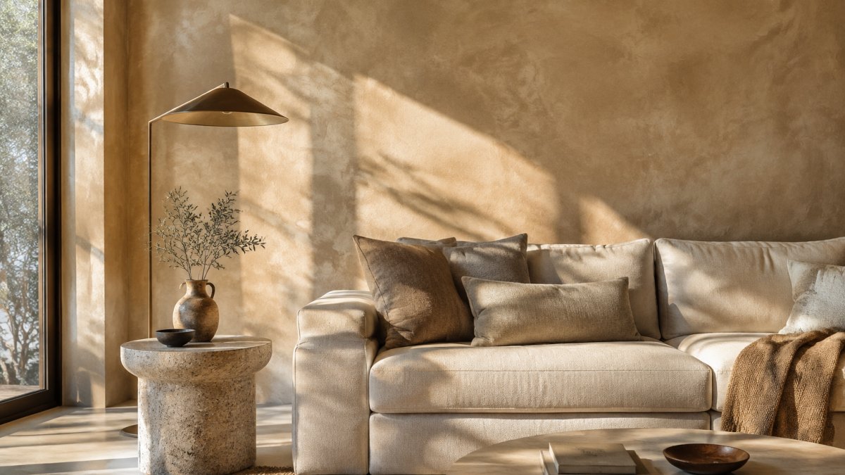
These three tones do the heavy lifting in most luxury interiors. Soft white reads clean without the flat glare of standard paint. Limestone white adds a faint mineral cast that mimics natural stone. Oyster beige sits between the two, warm enough to soften a north-facing room, neutral enough to pair with almost any furniture.
In practice, limestone white can work well in entry halls and stairwells where you want light to travel. Oyster beige can suit living rooms with linen and wood. Soft white is a reliable choice for ceilings and trim transitions.
Warm Greige, Mushroom, and Clay
Warm greige and mushroom add depth without committing to a color. They are forgiving in rooms with mixed lighting, which describes most Bay Area homes with large west-facing windows and fog-cooled mornings.
Clay and terracotta-leaning tones bring in modern earth tones with more personality. Clay can suit dining rooms and powder rooms where a warmer, earthier mood fits the use. Marble-look and stone-motif finishes pair naturally with these palettes if you want texture to carry the color, and you can see the range of faux marble and stone finishes we work with.
2. Cool Neutrals: Ash Gray and Marble-Inspired Finishes
Ash gray is the cool neutral that still feels luxurious, provided you avoid blue undertones that turn cold in low light. A true ash gray with a hint of green or taupe stays sophisticated rather than clinical.
Marble-inspired finishes can take this further. A marble-like finish in a soft gray or white base can give the veining and depth of natural stone across a whole wall.
Where it falls short: cool neutrals can read sterile in a room with no warm wood or textile to balance them. Pair ash gray with walnut, brass, or a wool rug, or the room will feel like a showroom.
3. Jewel Tones and Bold Colors for Statement Walls
Saturated color is where Venetian plaster earns its reputation. A deep emerald or sapphire in a lime plaster finish has a depth that flat paint cannot produce, because light moves through the layers rather than bouncing off a single film.
Emerald, Forest Green, Sapphire, and Ruby
Emerald green and forest green are the most requested jewel tones we see for living rooms and dining spaces. They read as nature-inspired and grand without tipping into novelty. Sapphire blue suits libraries, studies, and hotel bars. Ruby red is the boldest of the group and works best in small doses: a feature wall, a niche, or a powder room.
Treat these as accent walls, not whole-room commitments, unless the room gets generous natural light. In a dark hallway, a saturated green will read closer to black than you expect.
lime plaster vs Venetian plaster: How the Base Changes the Color
The base material changes the final color more than most people realize. Lime plaster is a mineral finish made from lime putty and marble dust, and it dries with a matte, chalky surface that mutes and softens color. Venetian plaster is a lime-based finish built up in thin burnished layers, and its polished surface reflects more light, so the same pigment reads deeper and more saturated.
Practical difference: a warm beige in lime plaster looks powdery and soft. The same beige in a burnished Venetian plaster looks richer and slightly darker. If you are choosing between the two, pick the finish first, then the color, because the finish sets the ceiling on how vivid the tone can go.
high gloss Venetian plaster and How Finish Alters Color
High gloss Venetian plaster pushes color to its most dramatic. The burnished, near-mirror surface amplifies saturation and reflects the room back at itself, which makes a deep emerald look almost wet and a soft white look like polished stone.
High gloss shows every imperfection in the substrate and every fingerprint, so it demands a flawless application and a room that stays clean. Matte finishes hide more and suit family homes better. If you are investing in a colored finish, it helps to know how to keep it looking right, and our guide on how to clean and maintain Venetian plaster walls covers the routine.
Venetian plaster application techniques That Protect Color Consistency
Color consistency lives or dies in the application. The same bucket of pigment can produce a patchy wall or a seamless one depending on how the layers are built.
Three techniques matter most:
- Consistent batch mixing. Pigment must be mixed identically across every batch, or you get a subtle seam where one batch meets the next.
- Uniform layer thickness. Uneven layers dry at different rates and pull color unevenly.
- Controlled burnishing. Over-burnishing one area and not another creates sheen variation that reads as color variation.
A common mistake is touching up a wall months later with fresh material. Lime plaster continues to cure and shift tone slightly, so a patch rarely matches. Planning the whole wall in one continuous session is generally advisable. Cracking is the related risk, and our article on how to prevent Venetian plaster from cracking explains what causes it and how the application sequence prevents it.
Choosing Venetian Plaster Colors for South San Francisco Bay Area Homes
Local light should drive the palette. South San Francisco and the surrounding Bay Area can get cool morning fog and strong afternoon sun, and a color that looks warm in a showroom can shift noticeably over the course of a day.
How Bay Area Light Changes Plaster Color
Venetian plaster carries light differently than paint because the burnished surface reflects the room back at itself. In South San Francisco, the practical effects are consistent:
- North-facing rooms receive cool, indirect light all day. Warm undertones (oyster beige, clay, warm greige) counteract that cool cast; cool grays and blues will read flat or dingy.
- South-facing rooms get strong, consistent daylight. Soft white and limestone white stay elegant; saturated tones can go harsh at midday.
- West-facing rooms take intense afternoon sun and warm up considerably. A color that looks balanced at noon can read orange by 4 p.m.; choose slightly cooler undertones than the sample suggests.
- East-facing rooms get bright morning light that fades by afternoon. Mid-tone warm neutrals hold up best because they do not depend on strong light to look rich.
Artificial light matters too. Warm bulbs (2700K) push plaster toward yellow and can make a warm greige look muddy; cooler bulbs (3000K-3500K) keep undertones truer. If a room mixes daylight and warm lamps, test the sample under both before committing.
Room-by-Room Recommendations
Use and moisture exposure should shape both color and finish, not just aesthetics:
- Living rooms: oyster beige, warm greige, and soft white for whole-room calm; emerald or forest green on a single feature wall if the room gets generous daylight.
- Kitchens: limestone white and soft white in matte or satin, because grease and steam show on gloss and dark tones reveal every splash. Keep saturated color to a backsplash-adjacent accent rather than full walls.
- Bathrooms and powder rooms: clay and terracotta work well in powder rooms with warm afternoon light; for full baths, choose a matte finish and a mid-tone color, since high gloss plus moisture plus daily use is a maintenance burden.
- Bedrooms: warm greige and mushroom are the most forgiving under mixed light and read restful rather than flat. Avoid high gloss here; matte suits the use.
- Entryways and stairwells: soft white and limestone white help light travel in low-light circulation spaces.
- Feature walls: jewel tones and high gloss finishes photograph well and hold a mood, but budget for maintenance in high-traffic areas.
Coordinating Plaster with Flooring, Cabinetry, and Stone
Rather than picking a color in isolation, match it to what is already in the room. A simple method most designers use:
- Identify the dominant undertone in the flooring (oak reads warm; gray tile reads cool).
- Pull the plaster one step warmer or cooler than the floor, not identical, so the wall and floor do not blur together.
- Check the color against cabinetry and stone samples side by side in the actual room, not on a white sample board.
- Confirm the finish before finalizing color, because gloss deepens saturation and matte mutes it.
Sample Testing Before You Commit
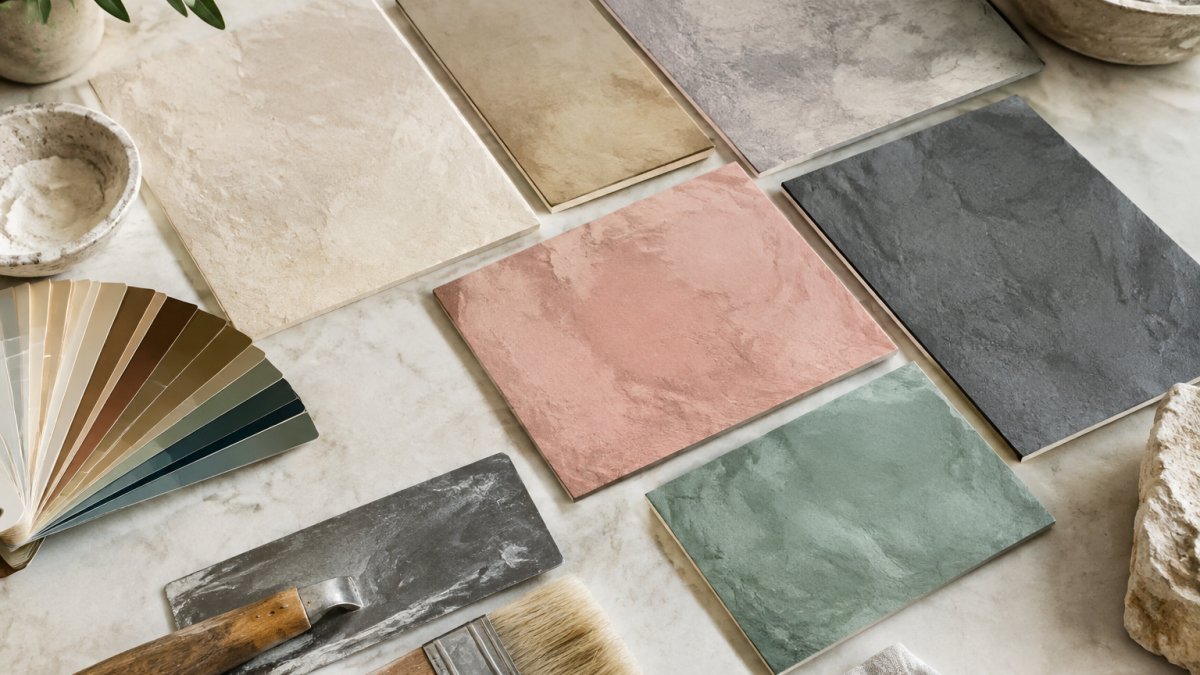
Always approve a physical sample on your own wall, not a fan deck. Apply the sample at the intended finish and number of coats, then view it at morning, midday, and evening. A common pattern is for a color to look perfect at noon and too gray by 9 a.m.; only an on-wall sample reveals that. When you are ready to move from samples to a finished wall, you can explore our Venetian plaster and mural services or request a consultation with our team to talk through palette, finish, and timeline for your space.
Quick Reference: Palette by Room and Light
| Palette | Best Room | Light Condition | Finish Pairing |
|---|---|---|---|
| Soft white / limestone white | Entry, stairwell | Low natural light | Matte or satin |
| Oyster beige / warm greige | Living room | Mixed, north-facing | Matte |
| Clay / terracotta | Dining, powder room | Warm afternoon sun | Matte or marbleized |
| Ash gray | Modern living, lobby | Bright, balanced | Satin or high gloss |
| Emerald / forest green | Living room feature wall | Generous daylight | High gloss or marbleized |
| Sapphire / ruby | Study, bar, niche | Controlled lighting | High gloss |
Frequently Asked Questions
Is Venetian plaster in style in 2026?
Yes. Venetian plaster is still a defining luxury wall finish in 2026, with warm neutrals and modern earth tones leading demand. Designers are pairing soft white, limestone white, oyster beige, and warm greige with natural stone and metallic accents for understated luxury. Jewel tones such as emerald and sapphire remain popular for feature walls in dining rooms and boutique hospitality spaces.
What are the most popular neutral Venetian plaster colors for modern homes?
The most requested neutrals are soft white, limestone white, oyster beige, warm beige, and warm greige. These Venetian plaster colors read as elegant rather than flat because the burnished finish shifts light across the surface. Mushroom and soft clay add depth without going dark. For cooler schemes, ash gray and marble-like finishes give a gallery-like minimalism that suits modern architecture.
How do light and shadow affect Venetian plaster color selection?
Venetian plaster changes through the day because its subtle sheen reflects light at different angles. A warm beige that looks creamy in north-facing light can read pink or gold in strong western sun. Always approve a sample board in the actual room, at morning, midday, and evening. High gloss Venetian plaster amplifies this effect, while matte finishes hold color more evenly.
Can Venetian plaster be custom-tinted to match luxury interior palettes?
Yes. Plaster can be tinted to match a specified palette, which helps a scheme stay coordinated across walls, trim, and stone. Bringing fabric swatches, stone samples, and paint chips to a discussion can help undertones align. Custom tinting can also let you carry a single hue through a whole room, a technique called color drenching.
What is the difference between lime plaster vs Venetian plaster colors?
Lime plaster and Venetian plaster share a lime base, but the mix and burnishing change how color appears. Traditional lime plaster tends to dry to a chalkier, more matte tone, while Venetian plaster with marble dust takes a higher burnish and shows more depth and movement.
Choosing a plaster color is a commitment, and the wrong tone under Bay Area light is expensive to undo. NuArts works with homeowners, designers, and commercial clients across the region on custom Venetian plaster, faux finishes, and hand-painted murals, with tailored palettes built around your rooms and your light. Get started with NuArts and specify a finish you will still love a decade from now.